I am a teen-drama junkie. You can basically tell me there's a show written for 15-year-old girls, and I'm all over it. In fact, I've probably already seen it. Twice. Even if I don't like it or don't think it's well done, I probably watch it every week anyway. Something about the melodrama drags me in and then I worry about the characters too much to tune out. Though I would argue most of them are better than most people give them credit for. I can totally understand why people aren't interested in the subjects these kinds of shows deal with, but a lot of people write them off as junk, which I don't think is fair. There's plenty of cheesiness and unnecessary dramatic flair, but shows about teens are inherently interesting because teens themselves are interesting. They're passionate and rash; they make terrible decisions but are able to rack up second, third, and fourth chances claiming naiveté or confusion or heart break. My favorites of the genre include adults because honestly dealing with parents and teachers is a major part of being a teenager, so ignoring everyone over the age of 21 seems wildly unrealistic.
All this being said, my post is actually about the promo posters these shows put out. Now I know they're going after their demographic of young females, but these ridiculous things don't even represent what the shows are actually about. You can still have the unnaturally good-looking people hanging all over each other and brooding into the camera while holding on to some semblance of the shows premise. Can't you?
1. The Fosters

This is a show about family, which you can honestly only tell by the fact that the tagline reads, "How do you define family?" Unlike most shows, this one defines family as undying support and togetherness. They strive to communicate often and always offer a warm embrace along with unnerving acceptance. (Even when the fifteen-year-old boy has unprotected sex, mind you, but that's another issue.) Just looking at the poster, I see separation. Sure, they sneak that one in at the bottom of the family in the kitchen, but the rest are a random assortment of pairings. Actually there's four of people on their own, two of "couples," one of the mothers with their daughter, and then the awkward kitchen shot. THAT'S WEIRD. Why isn't it one picture of all of them? Or at least a few collected photos of groups and/or pairings? And why do the people all alone look so... pensive? There was another poster for the first season that had them all sitting together on a beach. That was a bit better since they were all in one place, yet this is the one I see driving around LA. Finally there's a teen drama on TV that's actually about family togetherness, and this is how they try to get viewers. It's hard to even tell who's in the show. Plus, the characters have confusing and unique relationships since it's a family made up of two married women, one of their biological sons, adopted twins, and two foster kids. I get that they can't actually explain that in a poster, but perhaps snapshots of the biological ties and then one picture of them all coming together? Then anyone driving by could at least see this show puts the bond of family first, blood has nothing to do with the ability to love.
2. Pretty Little Liars

So, they're guilty, yes? This makes them look guilty. They're covered in dirt. Why are they covered in dirt? Um, from digging a grave obviously. Except not because the show is about them being tormented by someone going by the name "A" not running away from committing murder (I think... it's all a bit confusing to be honest). Truthfully, I think the look of this poster. Pretty girls getting dirty. It's simple, it's clever, it's cute. It just doesn't make any sense. They aren't even suspected of the murder for long. There's one where they're over a casket and Lucy Hale shhh's us, and that makes sense. Then it looks like they know something they won't share. This looks like the are 100% guilty. They even look happy about it. Look at their little smiles. Creepy, that's what it is. All their outfits make sense and I can get on board with the black and the graveyard, but they look maniacal and they aren't. Maybe the show would be more interesting if one of them were. But nope, they are just four teenage girls who lost their friend too soon and make very questionable decisions at every possible moment. They also seem to be incredibly stupid in some aspects of their lives while remaining unnervingly intelligent in others. You know what, maybe they are crazy and maybe this poster is just supposed to make you question everything.
3. Veronica Mars
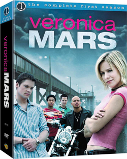
I would first like to say that the ever-sassy Veronica Mars would never say, "Get a clue." She would also make fun of anyone who did. She is a badass. That is her thing. Yes, she has marshmallow tendencies and cares about a select few, but she's much tougher than the pink T and little smirk make her look. As for the guys behind her, yes, they're all important. But the pier? Not so much. Good thing it takes up most of the page though and Wallace, Logan, and Eli look tiny. If I'm going to be nitpicky, which clearly I am, why is Logan in the back? For that matter, why is Duncan in the front? And why is Eli's motorcycle so big? Yes, he's in a gang, but that's not particularly crucial to understanding the show. Main question however: Where is Mr. Mars? Sure, Veronica has a male best friend and two male bffs she dates back and forth but her dad is her main man. She stayed with him after her mom left and they support each other through everything. The whole reason she's a PI is because of his influence. Yet is he shown? No. Not cool enough I guess. I'm not saying they should be front and center sharing a hug, but he should at least be back with the other three looking like a creeper. I know there are a lot of other posters for this show where more characters are shown, but Veronica still looks a bit weird in all of them. I think it's because she's the main character, so this probably isn't a creative decision, but she's always up front with her arms crossed or her hands on her hips and she looks completely ridiculous. It's as if she's trying to play the part of investigator rather than actually being phenomenally good at what she does. I guess I think this poster makes the show look hokey, which it really really isn't. I swear. Of all the shows on this list, this is the one I'd confidently tell people to give a shot. You have until March when the movie comes out. Good luck.
4. The Lying Game

Twins. There are twins. That's the point of this show, so good thing the poster is of ONE PERSON. Briefly, a recap, twins are separated at birth. Sutton ends up in a wealthy family. Emma ends up in foster care. They find each other. Sutton convinces Emma to pretend to be her while she runs off looking for their mother. Completely believable drama ensues. I guess this is supposed to be Emma attempting to be Sutton, but I still think it would make more sense to see both of them. The audience knows the scheme from the beginning, so there's no reason to keep the twins a secret, that's the whole premise. Other people are important, but I can accept them not being on the poster since it's really about the girls. GIRLS. Plural. I'm sorry, I'm sounding like a broken record, but literally every plot twist has to do with "the twins." That's literally what they all talk about. Who does and doesn't know about the twins and who's related to the twins and why the twins are so important. But here's just one of them, looking super shady by the way... by a creepy door... in the dark. Where is she going? Or coming from? And why does she look so nervous? The dress looks good, sure, but why is she wearing it? It looks like she's going to some fancy event and she does party from time to time but that's not her go-to outfit. The whole thing is confusing really and doesn't at all tell you that this is a show about two estranged twin sisters fighting to understand their past while continuously blurring the lines of their own identities. Maybe the two of them literally blurring into each other would be more effective, still attention grabbing and at least remain somewhat relevant.
5. Greek
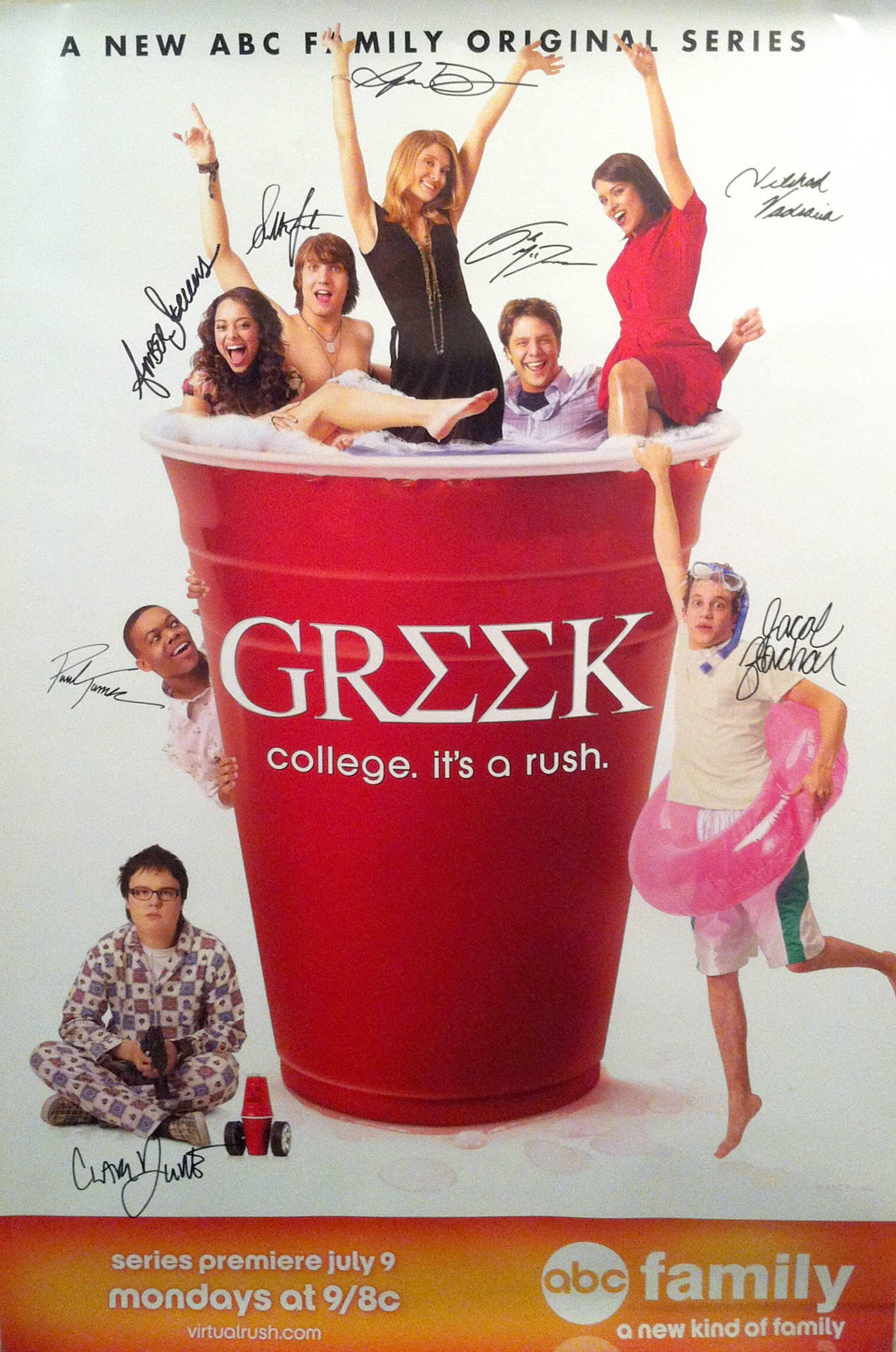 |
| *Please note that the autographs aren't actually on the original poster. |
This one I like. Greek is about party kids at a party school and here they are literally IN a solo cup - the preferred delivery system for all alcoholic beverages. The combination of the name and the tagline, "College. It's a rush." perfectly explains the entire series. In fact, I'm not sure I even have anything else to say, so this one can be a brief break from all my ramblings. You're welcome.
6. Teen Wolf

No. No no no. No. I don't even know where to start, so I'll go from top to bottom. His face - yes, his eyes turn yellow as he becomes a wolf, so fine. I'll give you that, but why is his shirt so bloody? It's ripped because of the transition, I get that, but why bloody? He doesn't kill as a wolf. Is that his blood? Because he seems unharmed. He also looks angry. Even as a wolf, Scott McCall is rarely angry. That's kind of a running problem for him. He's either scared or worried or nervous - not angry. The dude is a savior not a hunter and portraying him as a villainous character is uber confusing. Now the tagline, "Love. Be afraid." Um. What. Be afraid of love? Or love and then fear something else? Or just generally feel fear? Like all the time. I guess the characters are often afraid, but then why not just say, "Be afraid."? It's a little cheese-y but would at least make sense. And love what? Love a person? Love the wolf? Love him? Everyone loves him. And he loves everyone (almost). Should that fact be the scary part? I don't understand. The biggest issue though is the fact that he's alone. There are other Teen Wolf posters where he's not alone and some where he isn't on the poster at all, which also doesn't make any sense. But the ones where other characters are featured just have a bunch of floating heads looking scared or intimidating with some sort of haunted house or shining headlights in the back ground, which don't explain the show in any way either. I guess I feel like the posters don't do the show justice. As the seasons progress, the show has gotten darker and darker, forcing every character to redefine their own moral compass and truly understand who they can and can't trust. The teenagers grow closer to their parents, letting them in on all their secrets while simultaneously sacrificing everything in order to keep them safe. This show can be defined by the bonds characters have with each other, yet the posters make it look like a show about the struggle of being alone. That's neither effective or as interesting because where teen dramas usually focus on romantic relationships, friendships and family take precedence here. And to be honest, aren't those the relationships that help you survive adolescence?
7. The Vampire Diaries

First and foremost, what the hell is she wearing? I will get into the whole sex appeal of this poster later, but you can be sexy without wearing a weird black corset thing. because, for the record, Elena's most adventurous outfit includes jean short shorts and a flow-y tank top. The girl doesn't own anything with a plunging neckline and those strappy stilettos should be replaced with short boots or converse. Most TVD posters show Elena wearing some variation of this outfit and frankly, it's laughable. The guys do wear black a lot, so I'll allow that, although I'm not sure why they're all laying on a bed. Was the threesome they're trying to imply they had just too much so they all had to put their clothes back on then take a breather? Granted, this is a show with a strong love triangle, and yes, it plays a major role in the series, but there are other major characters who are rarely featured on TVD posters. I'm sure there are a lot of legal reasons for this, probably financial ones too, but on the show, Elena's brother is the primary way she makes decisions. And where would any of them be without the feisty witch Bonnie? Caroline and Matt may come and go within episodes, but they've been vital to the plot since day one. To be honest, my real beef with this poster is the over the top sexualization of all three of them. Sure, this is for teens and what draws them in better than the supposed promise of sex? But they're weirdly shiny (is that supposed to be sweat?), and they're all dark and sultry (okay, the vamps have had time to master the look, but she's supposed to be a "normal teenage girl" at the beginning), and really, there was no and never will be a threesome. If you need to get the triangle aspect across, can't they both stare at her from afar while looking both sad and tragically self-pitying because that fits in better with the average episode. She can also look torn, confused, and scared rather than as if she just had some amazing vampire sex with two hundred-year-olds. No lie, this is a good show that takes a really interesting stance on human nature and what it means to be a good person while delving into relationships between friends, family, and lovers. Yet this poster makes it look like a Twilight knockoff with extra sleaze.
These series aren't for everyone, I get that. I just wish their marketing could be... deeper.
*Inspired by this hilariously accurate video: http://www.darkhorizons.com/news/30327/votd-why-modern-movie-poster-art-sucks